Product:
Electronic Travel Authority App (iOS and Android)
Date:
2020
Role:
Lead Product Designer
How I’ve automated data entry and improved the experience of those applying for an Electronic Travel Authority (ETA) visa before travelling to Australia

The Department of Home Affairs was finding it difficult to manage the ETA visa data mismatch, due to the time it took to update the traveller data and interact with airlines/gates.
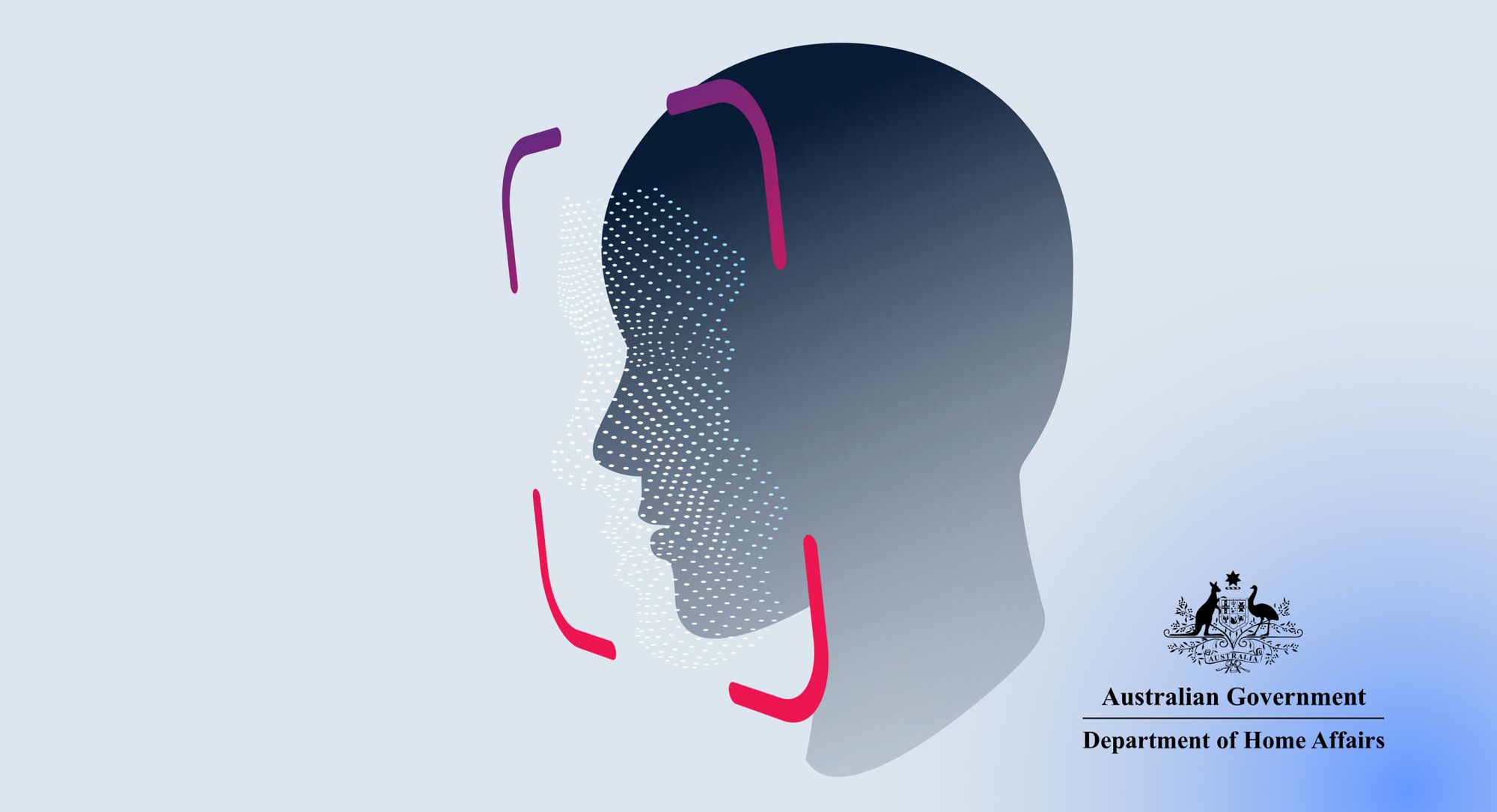
An ETA is an electronically stored authority equivalent to an e-visa, which is linked to a passport number.

When the project started, the Department of Home Affairs offered an ETA product (web-based website) as the primary entry point for users to apply for the ETA, to facilitate clients from nominated countries visiting Australia for short-term tourist or limited business activities The process could take anywhere from a week to two months
I wanted to meet with those who were significantly involved in the visa approval process the border control and management providers. Therefore, I contacted the key stakeholders in Sydney, SITA and the Department of Home Affairs. I gained access to relevant and high-security data and also interviewed some of their staff. Some data analysed:
Before visiting Australia, people need to apply for a visa and manually fill out a multi-page form on the ETA website with the following information:

We also analysed worldwide business trends on e-visas and found out that:
Malaysia was the first country from APAC to collect biometrics through visa applicants and now expected to have the largest market share in the Asia-Pacific e-visa market.
Countries that have additional support for e-visas have helped the market share grow in the region
The need for smart processes that eliminate manual entries and support operators and the demand for flexibility and scalability, are expected to be the key drivers for the future.
I took a few steps back and looked at the original challenge again. This time, with much more context to the problem.
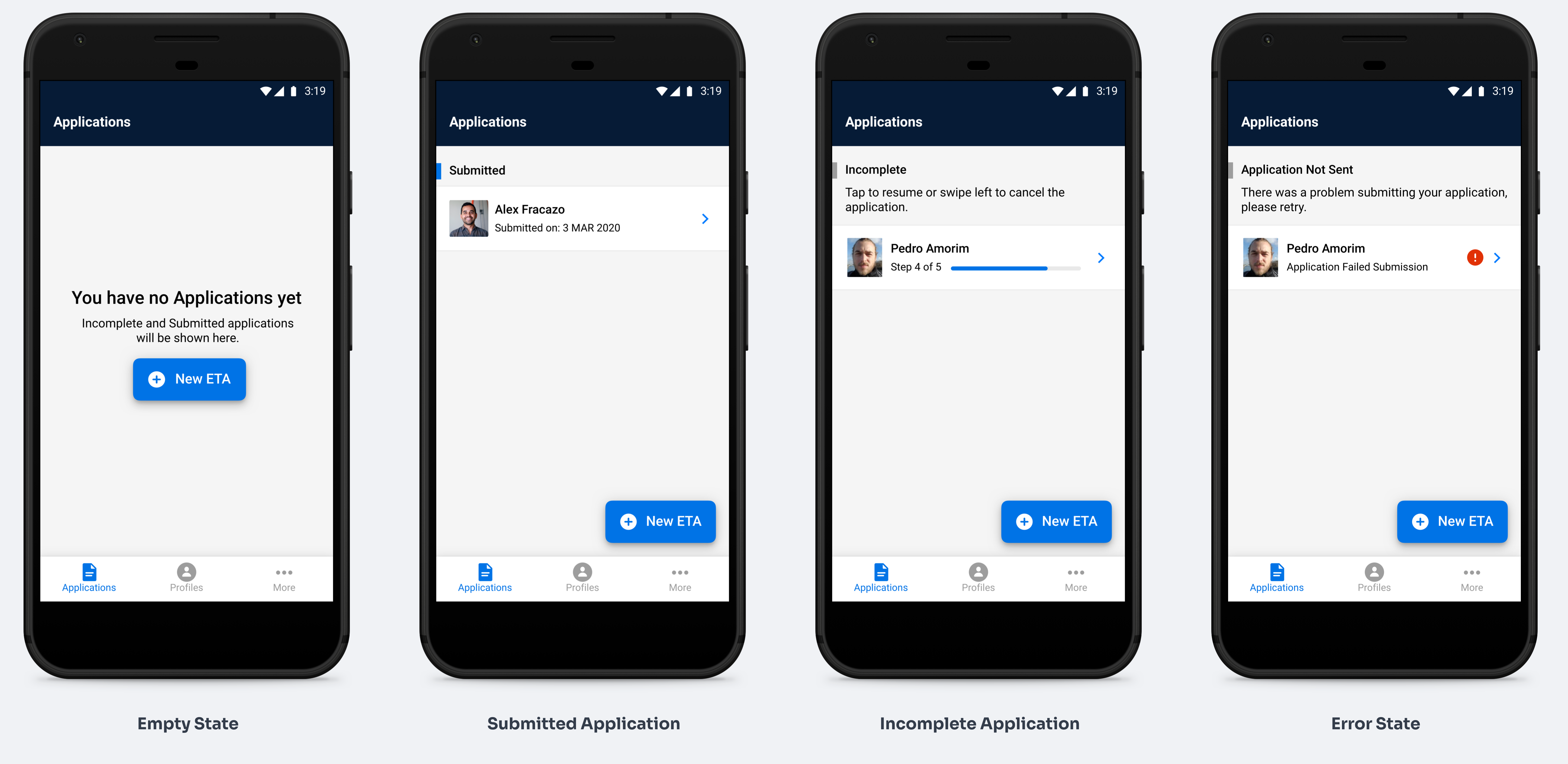
Improve the quality of data from travellers and improve the application user experience
Traveller data was manually entered in a web-based application
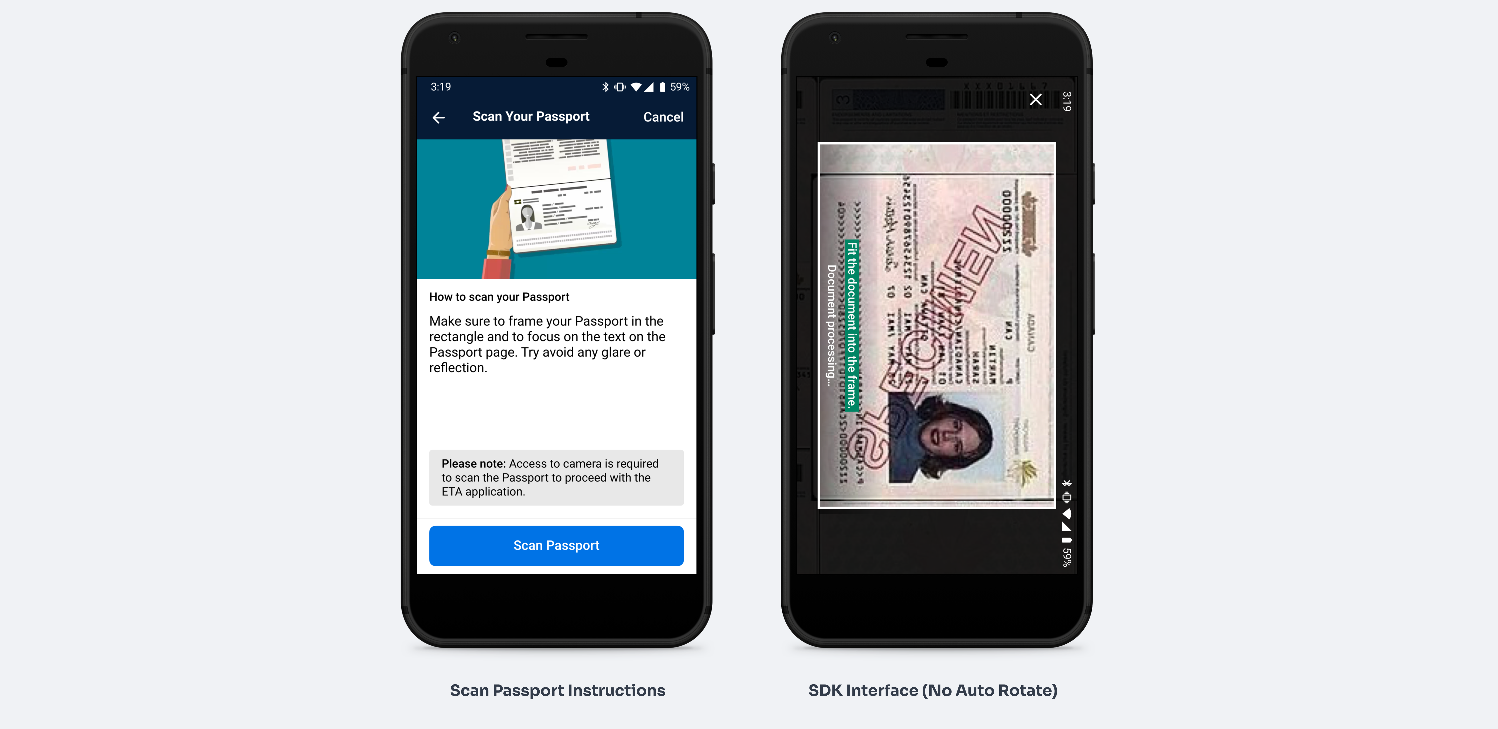
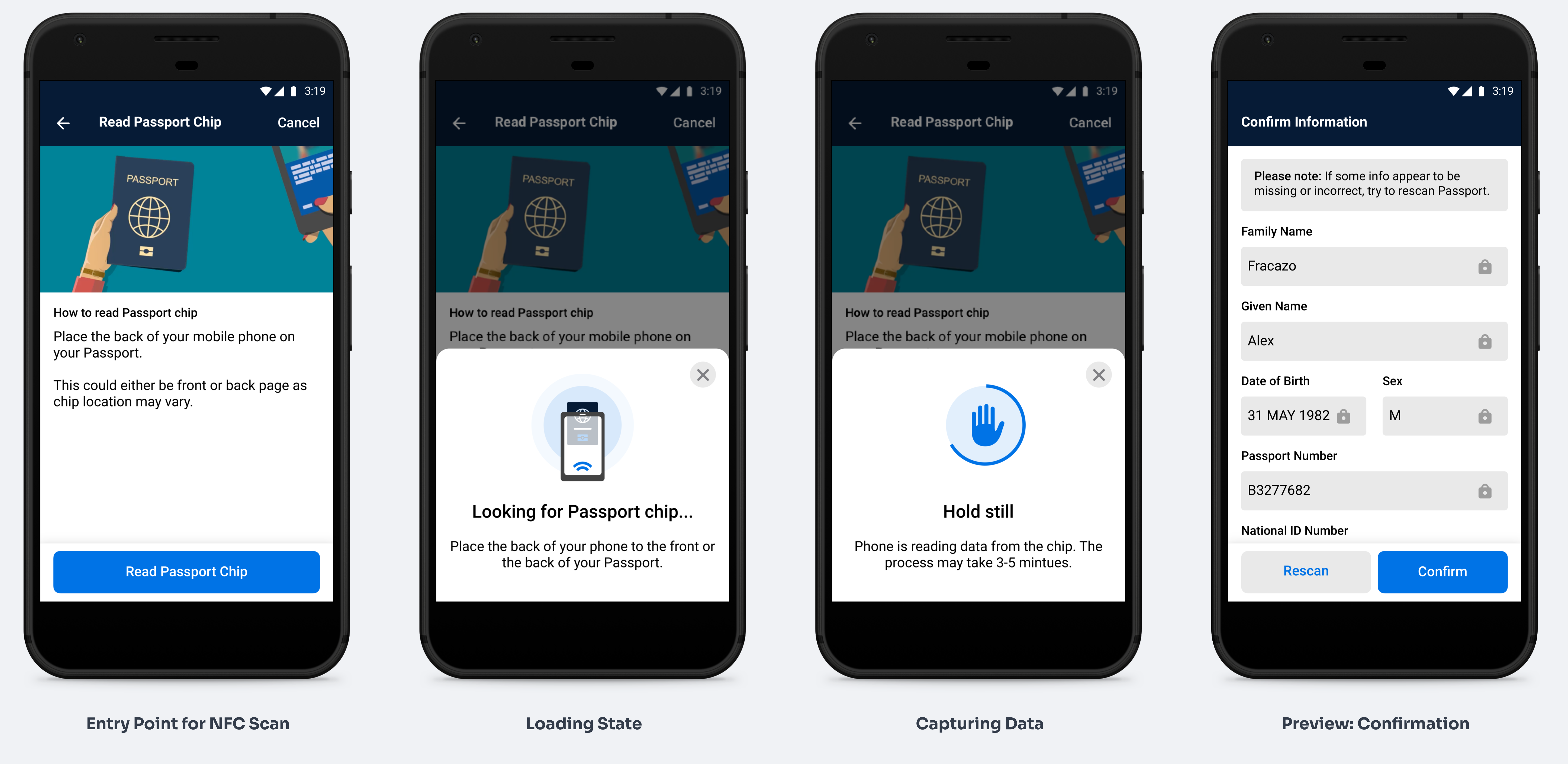
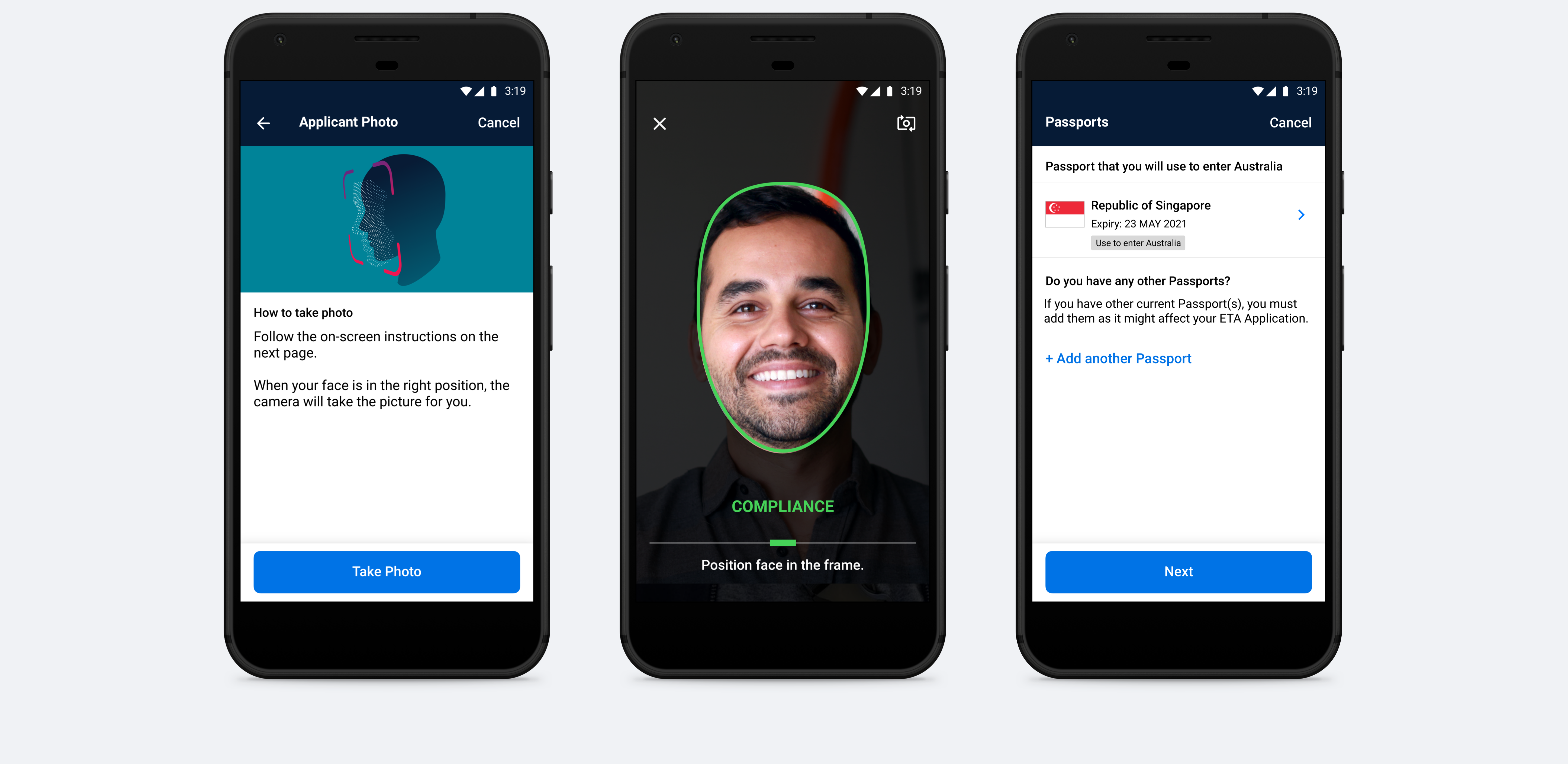
A solution to improve the data quality could be capturing the biometrics and passport chip information using a mobile app to extract the data
Implement an external SDK module on a mobile app, where we could test the impact of using the device's capabilities to collect biometrics
The manual method of data entry has downstream impacts on the border process as it is susceptible to accidental human error
Design an improved ETA application experience that will help travellers to Australia apply for an e-visa using their personal device.
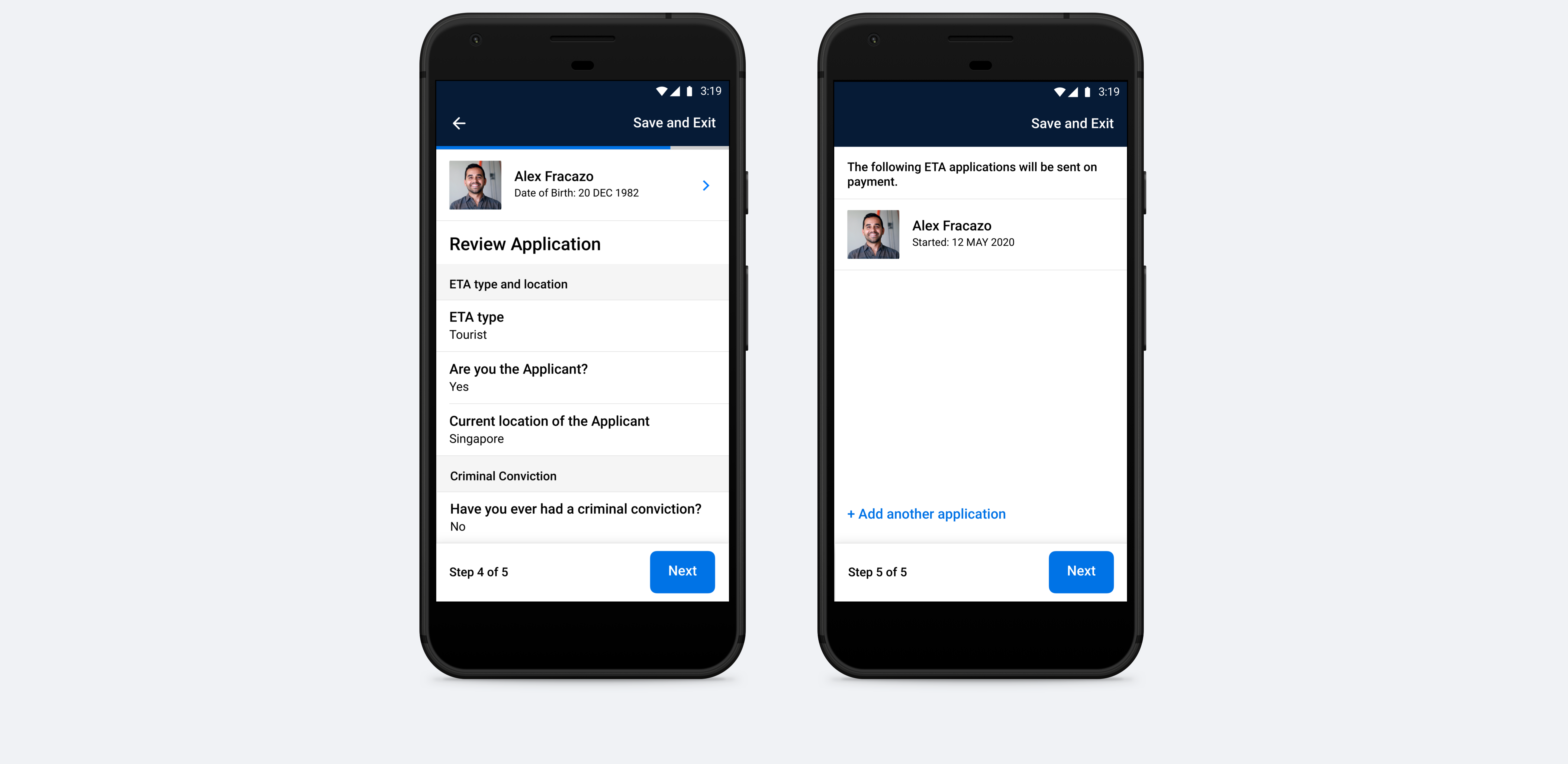
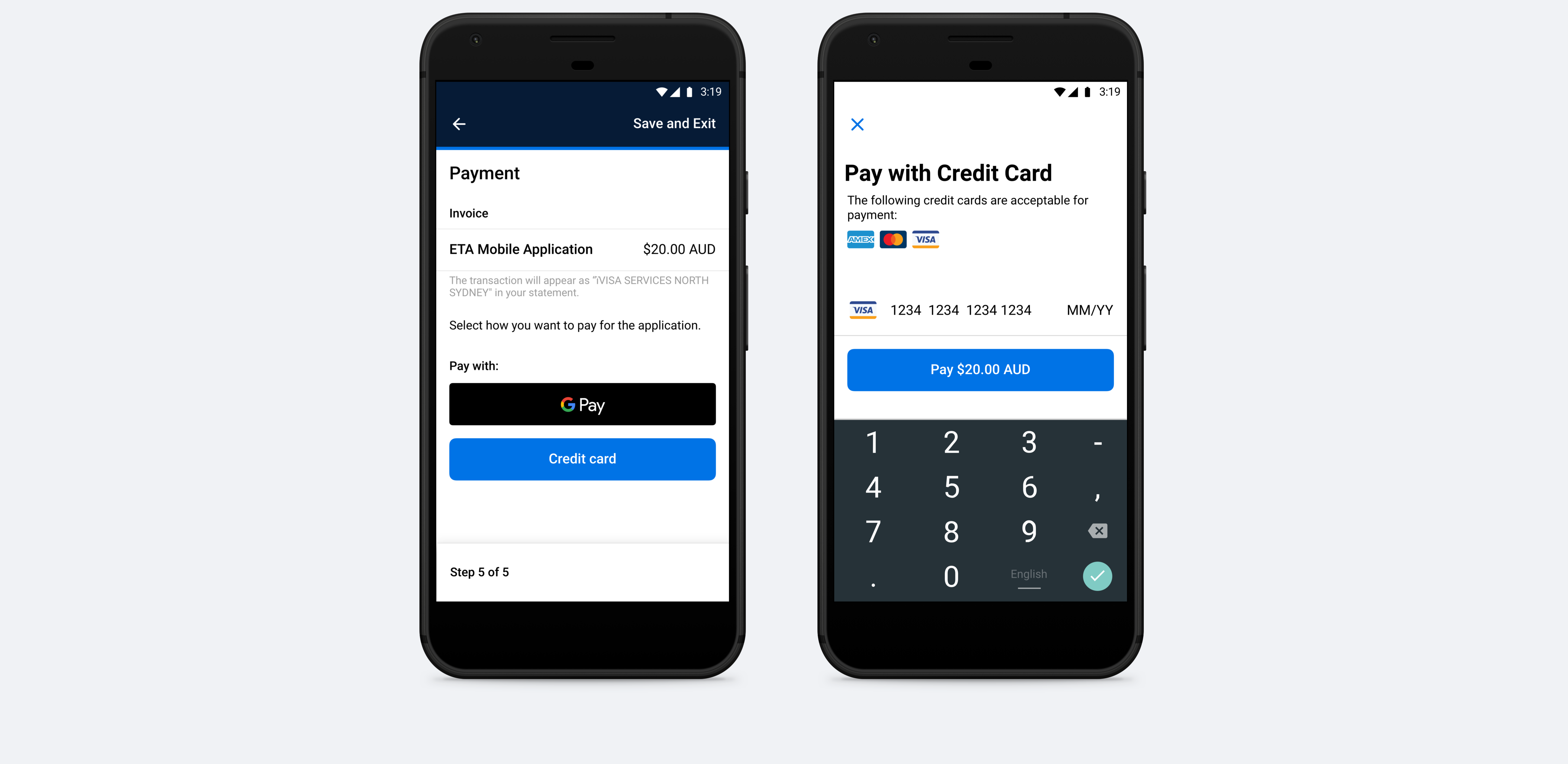
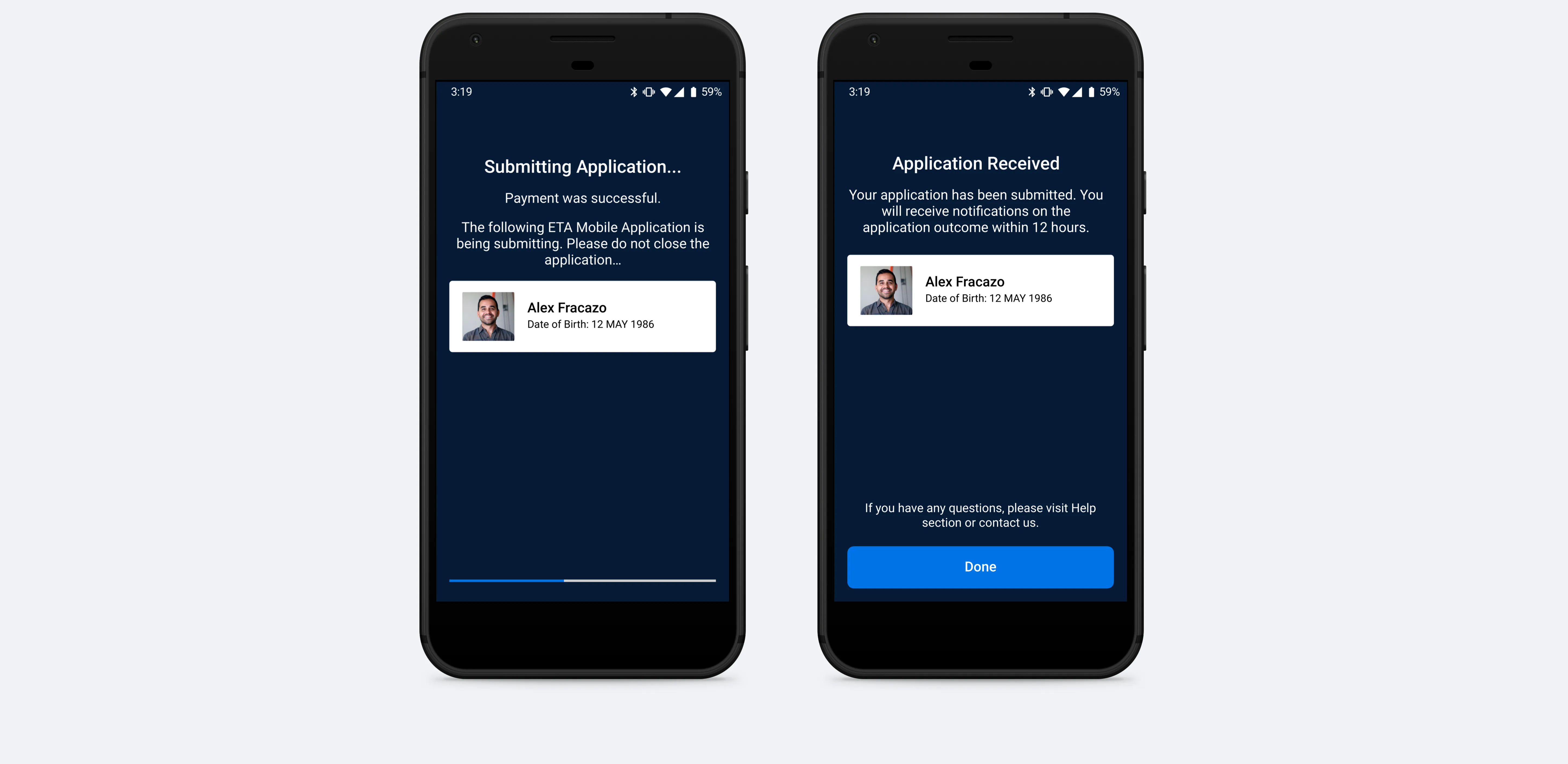
The Minimum Viable Product for the ETA mobile app would be the capability to capture the passport data and user biometrics, and also enable users to easily pay for an ETA application using their device.
The user would be able to add multiple travellers’ ETA applications, bucket payments and submissions.
Due to the complexity of the problem, I started sketching some possible solutions and decided to break it down into a few "How might we" questions, allowing me to focus on one challenge at a time.
How might we easily guide the user step by step, to capture user and passport biometrics?
How might we automatically capture data from the user's passport using the user's personal device?
How might we design and develop an ETA mobile app to improve the quality of data received from the traveller, capture the biometrics of the applicant and improve the overall user experience in applying for an ETA?

Improve the ETA application experience for travellers wanting to visit Australia
Given the ideas that came up in the sketching sessions, I defined which solutions had the most potential to effectively solve the problem and decided to map out a possible main user flow.
As the solution became increasingly clear, so did the level of detail and fidelity of the artefacts. At this point, I began to explore user flows in more detail, while at the same time considering possible interactions and interfaces.
I ran user testing with 8 participants combining early design concepts and the biometrics SDK software we would incorporate in the app. Our primary objective was to identify:

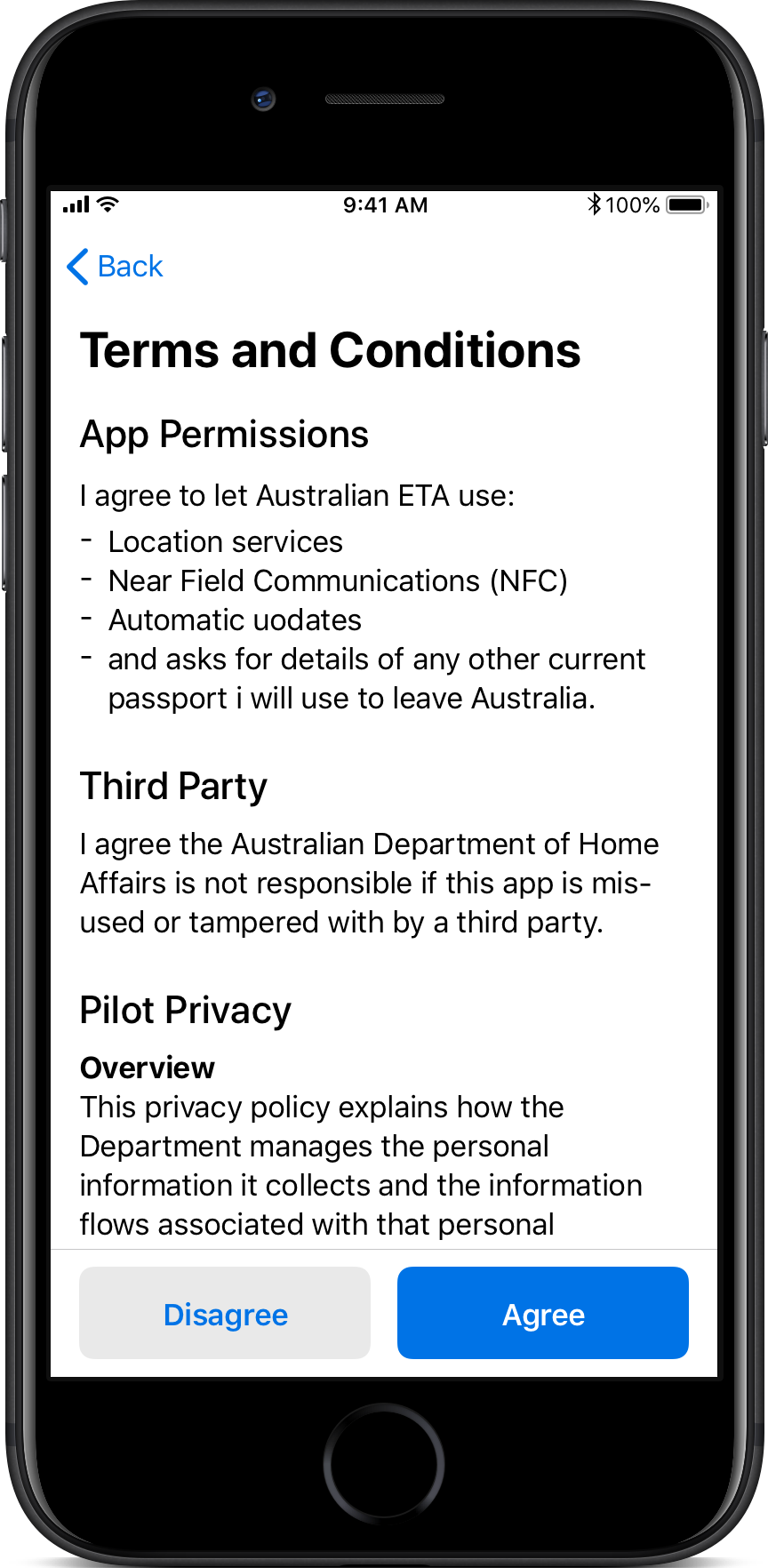
Due to the legal complexity of collecting private and biometrics data from users, the onboarding and registration process was 5 multi-complex steps where users needed to view, acknowledge and agree.
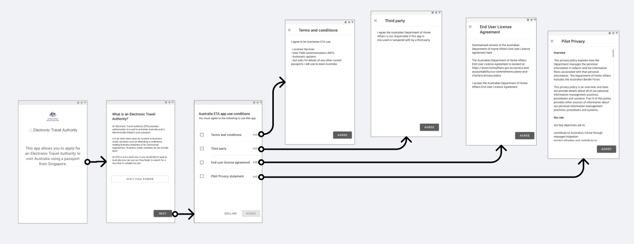
We tried different approaches to reduce the steps from the user side and had approval from the legal team.

My approach was to remove the checkboxes and merge the agreements into a single page.
The design principles that I focused on most for this project were accessibility and inclusion, as it is an application that people from different cultures and age groups can use. Some of the guidelines I had in mind while creating the user interface were:
The app provides a utility so the interface should feel native and simple to the device the person is using
The colours used in the design were adapted from the Home Affairs Brand guidelines to create customer empathy through the visual and brand connection.
The preferred typeface from the Brand Guidelines was Helvetica Neue, but since the App is heavy on data, I chose to use the device's native fonts to minimise the screen load so that the app feels light weight as user actions should be quick to respond.

One of the biggest trade-offs for this project was having to compromise usability. We had to change the design of the passport capture screen to accommodate an SDK interface from an external provider, we were using their service to capture the passport information and process it into data.
Microcopy played a huge role in product design, many rounds of copy review went into this project. Some guidelines used in the designs and development were related to title style capitalisation.

Working with engineers is a big part of my role which I ❤️
For this project, I’ve used Sketch, Abstract and Zeplin, which work great for syncing files and providing developers with assets.
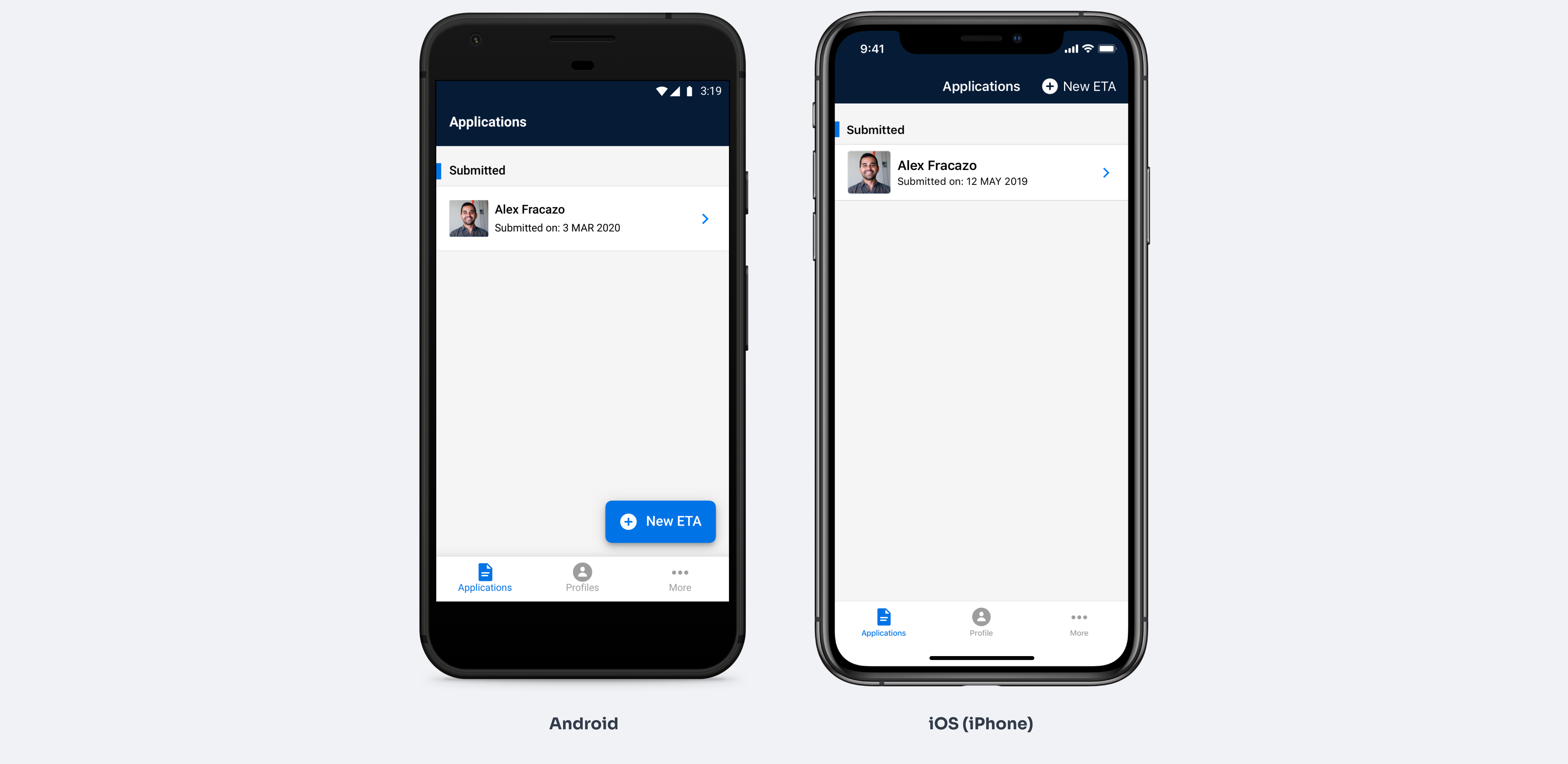
Assets were created for Android and iOS
There’s a user expectation of how these types of UIs operate, so there aren't many opportunities to take a conceptually unique approach. My solution was to design a “standard” step-by-step app that included fun details where possible, such as loading state and user feedback animations.

Additional metrics I would look for


Building more than just a product, a brand experience for Qantas Entertainment

How to increase app downloads by +70% by connecting entertainment services in the flagship app “Qantas Airways”

I’m showcasing how we’ve changed user behaviour by design and increased the booking (connection) rate on Hireup by +12%